YOROKOBU Magazine
YOROKOBU Magazine
YOROKOBU Magazine
YOROKOBU Magazine
YOROKOBU Magazine
Print Design
Print Design
Print Design
Print Design
Art Direction
Art Direction
Art Direction
Art Direction
Graphic Design
Graphic Design
Graphic Design
Graphic Design
Print Design
Print Design
Print Design
Print Design
Illustration
Illustration
Illustration
Illustration
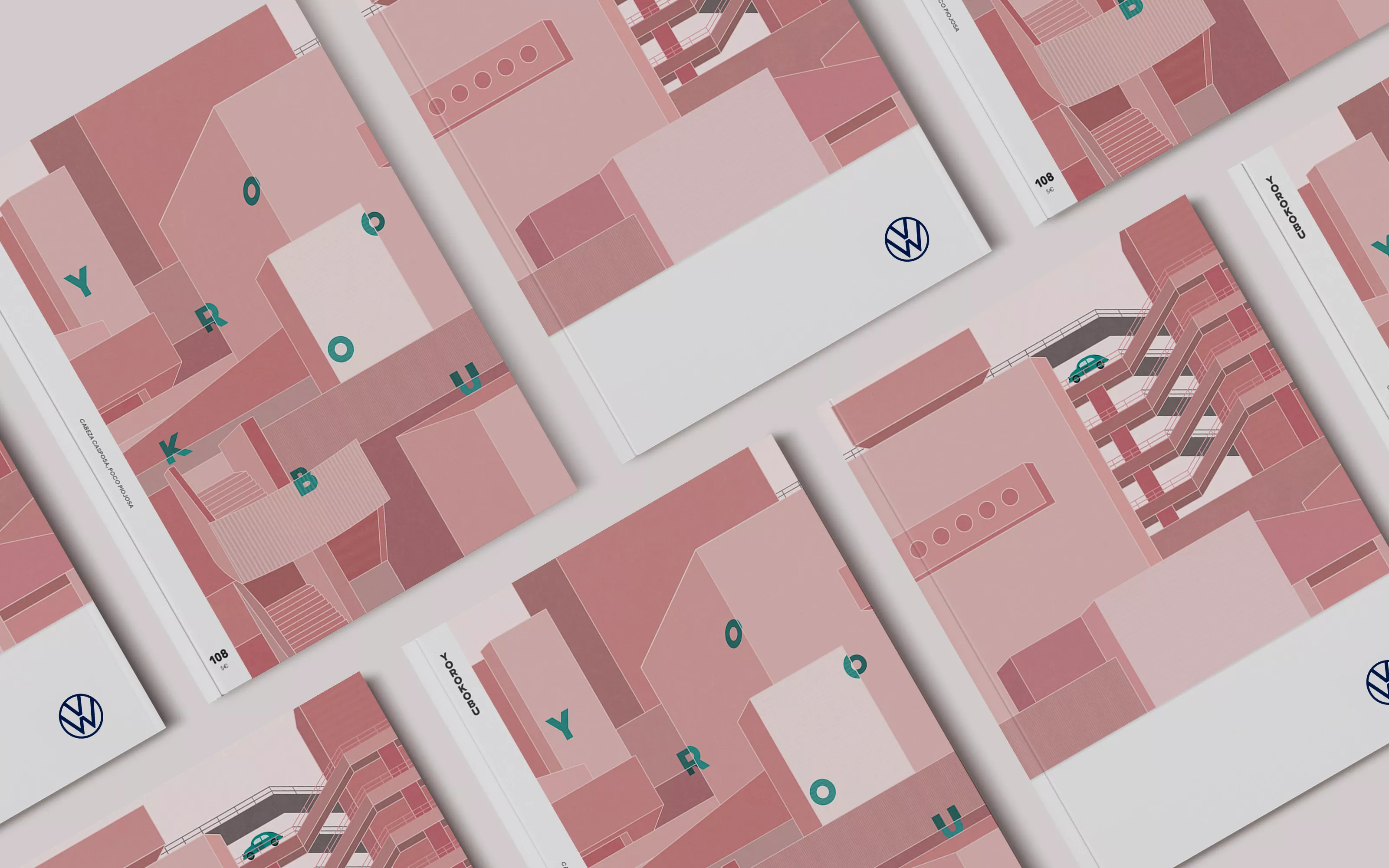
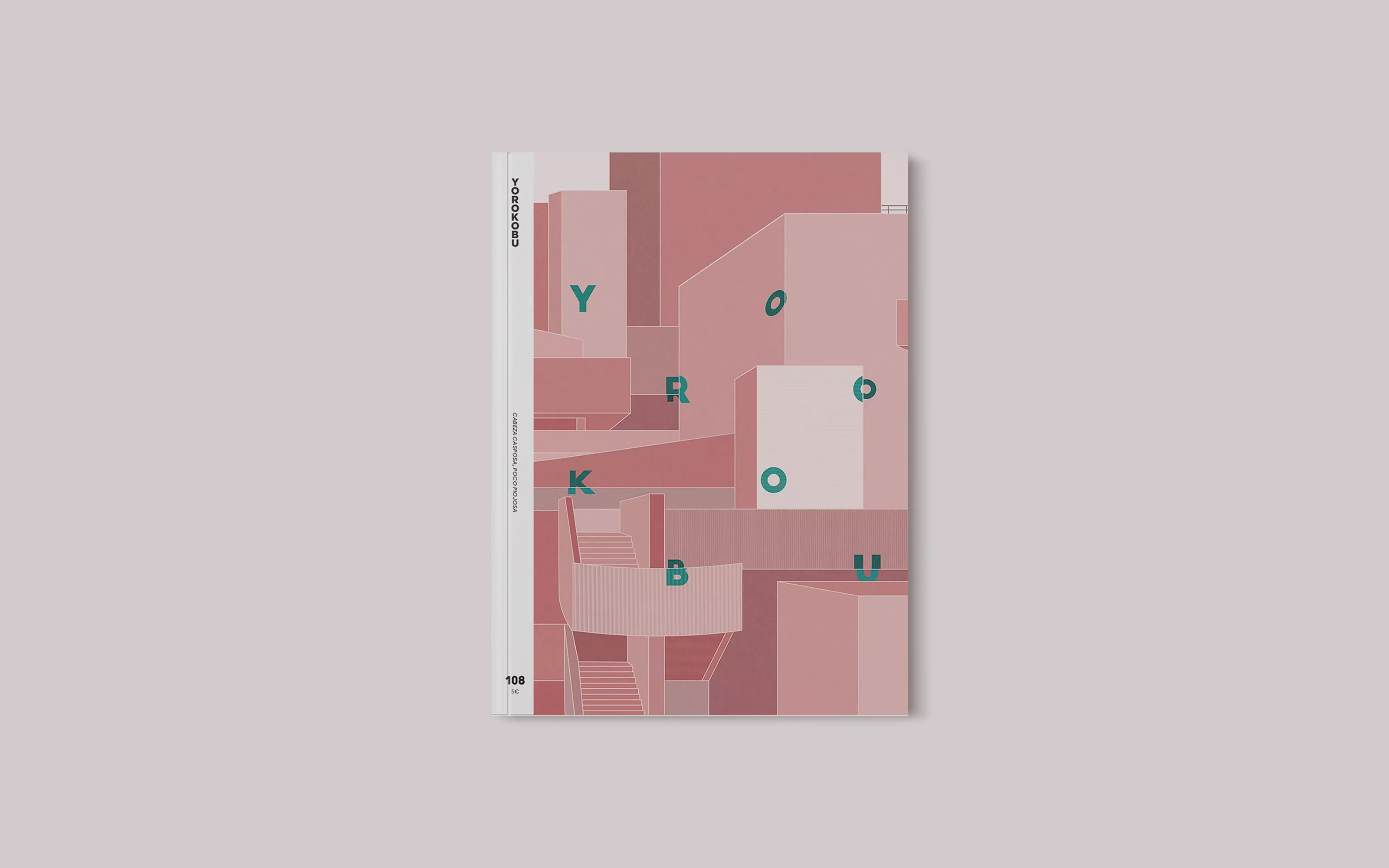
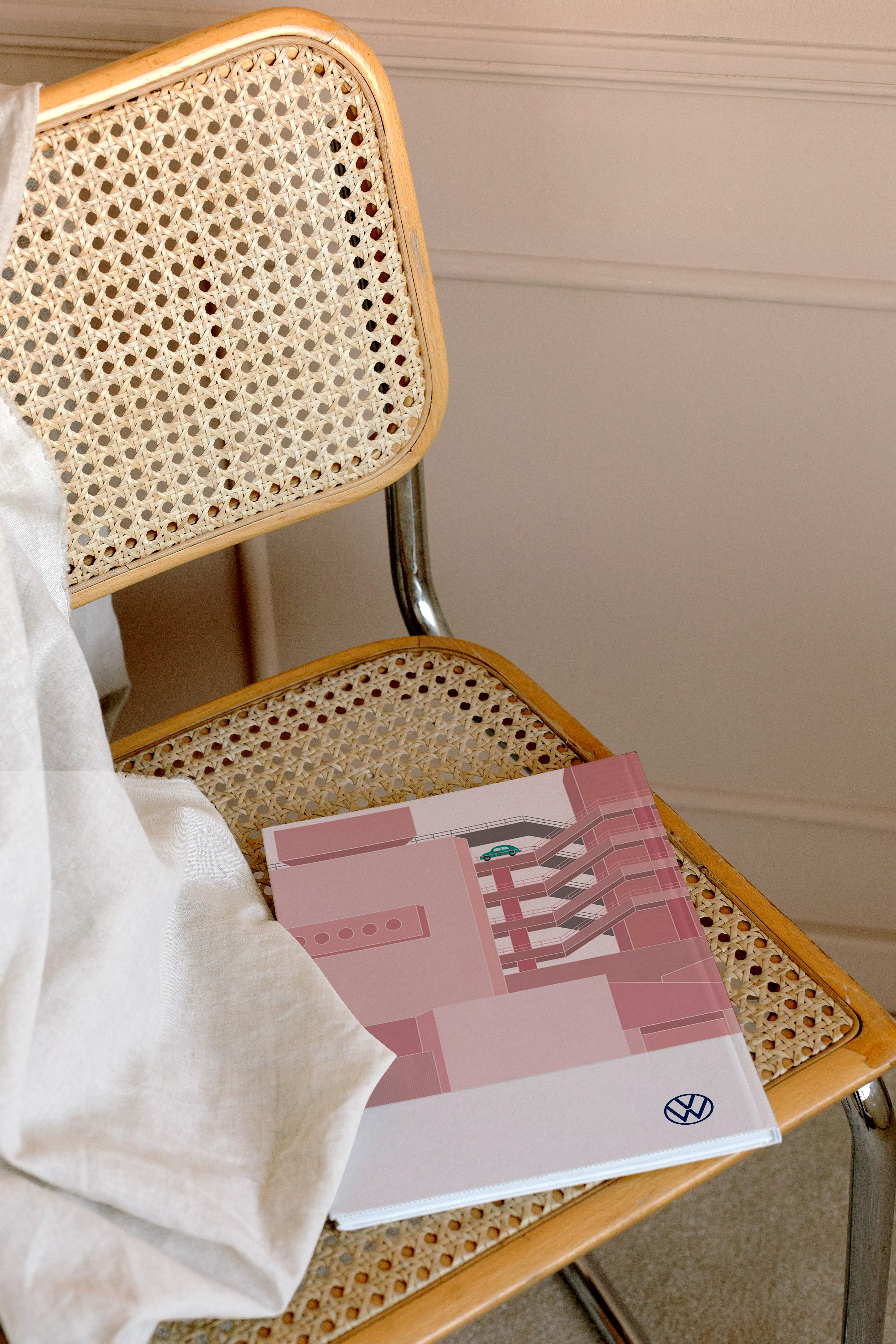
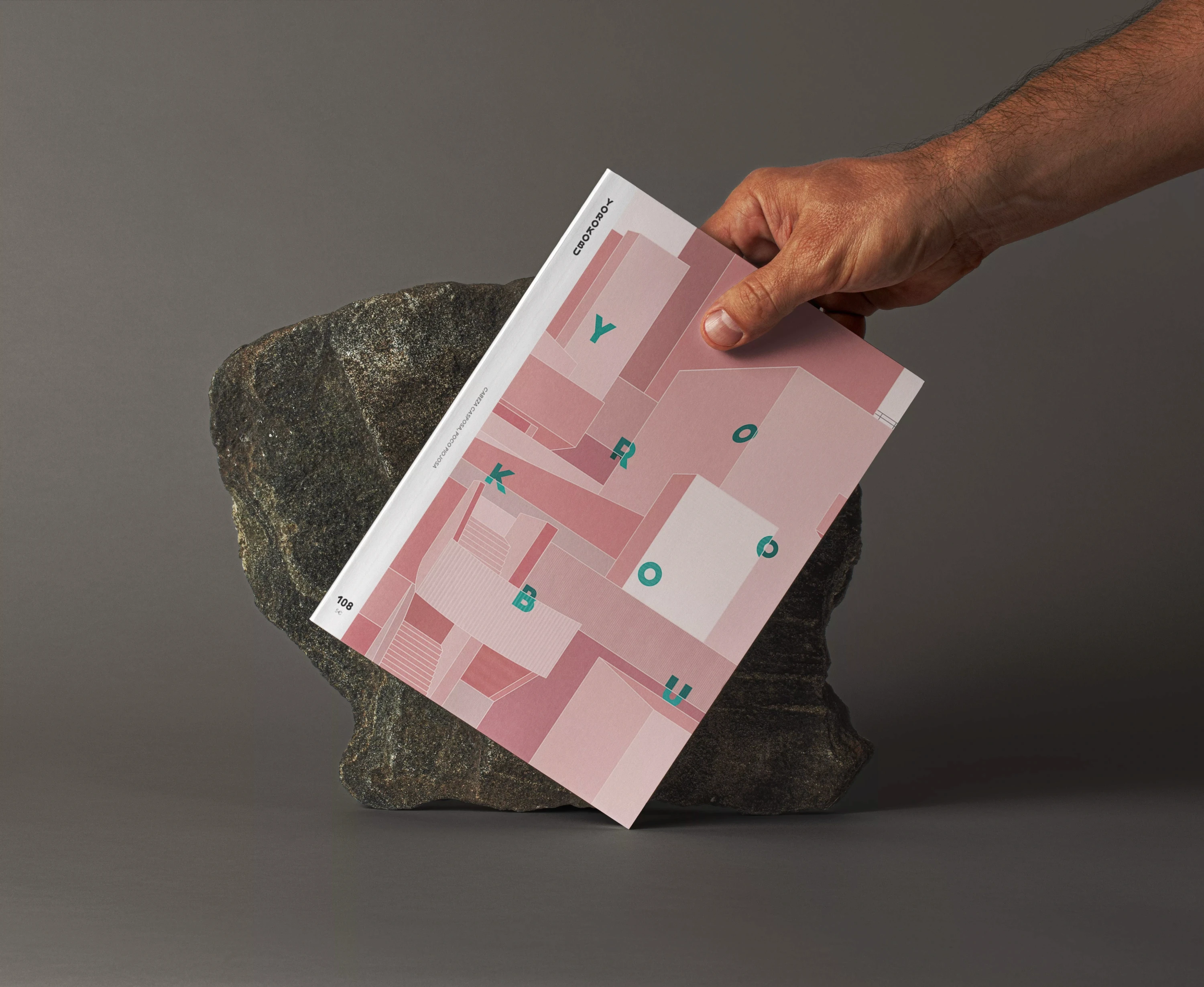
When it comes to magazines specializing in Spanish creativity, Yorokobu is undoubtedly one of the most popular. Collected on bookshelves, office desks and cafes all over the country, the magazine is an industry benchmark. Each cover is created by a different artist: from photographers to plastic artists or graphic designers, everyone has creative freedom to make each issue unique.
The only briefing requirement was to create an illustration containing the word Yorokobu and an element related to Volkswagen had to appear. The front and back cover are inspired by brutalism (especially the National Theater in London) and isometric perspective, and both create a complete work that is divided between the two sides of the issue.
I wanted to play with two main colors that create contrast (on one side the cityscape and on the other the text and the car). Then I played with saturation, tone and opacity to create depth without moving away from the mostly flat aesthetic I wanted to achieve.